Articles13 min read

Learning Wall Art Bundles: A Grow-With-Child Guide for Kids

How to curate learning wall art bundles that actually teach — three age tiers, eye-level placement, coordinated aesthetics, and a rotation schedule so the wall grows with the child instead of being wallpapered once and forgotten.

cheerful young children looking at a colorful feelings chart with friendly emotion faces

Learning Wall Art Bundles: A Grow-With-Child Guide for Kids

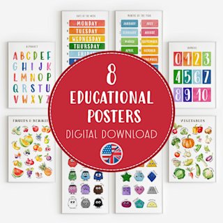
I wallpapered my daughter's wall with educational posters when she was two. Six of them — alphabet, numbers, colors, shapes, animals, a world map — bought as a set and arranged in a tidy grid at my eye level, because that is where grids look balanced. For three weeks she pointed at the alphabet and named a letter a day. Then she stopped looking at the wall entirely. The posters were still there, still colorful, still correct. They had simply become furniture.

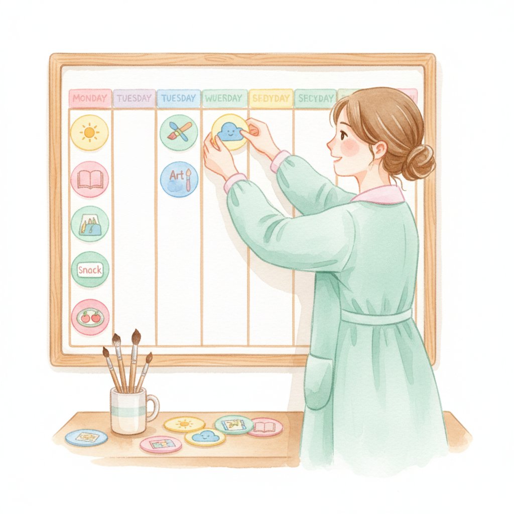
The wall that worked was smaller and lower. Three coordinated pieces, hung at her eye level, swapped every few months as her skills moved on. She is five now and still talks to the wall — the current map has been there four months and she still finds something new on it. The difference was not the art; it was the design. A learning wall is a curriculum you hang on drywall, and like any curriculum it works when it is sequenced, placed where the learner is, and refreshed before it turns invisible.

This guide is the practical version of what I learned designing learning walls and curating learning wall art bundles at home and in classrooms. You will find why environmental learning works at all, the three age tiers that let one wall serve a child from toddlerhood into early elementary, the placement rules that decide whether the art gets looked at, the aesthetic logic that keeps it from looking like a preschool classroom exploded in your living room, and a rotation schedule so the wall keeps earning its wall space. For the wider classroom-display picture, pair this with our classroom poster set guide and the classroom decor ideas we use across both settings.

Why a Learning Wall Works at All

A watercolor illustration of cheerful young children looking at a colorful feelings chart with friendly emotion faces

The case for educational wall art is not aesthetic; it is a well-documented phenomenon called environmental print learning. Children learn a surprising amount from text and images they encounter repeatedly in their environment, without any direct instruction. The child who sees their name on a cubby every morning learns to recognize it; the child who lives with a number line on the wall learns the counting sequence the way they learn a song — by ambient exposure long before anyone "teaches" it.

Three principles from the early-literacy and environmental-design fields frame the whole guide:

  • Repeated low-stakes exposure builds recognition. A child who glances at an alphabet poster twice a day for a year has seen each letter hundreds of times. None of those glances was a lesson. All of them together were.
  • Placement determines whether exposure happens. Art at adult eye level is, to a child, ceiling. The single highest-leverage decision in this entire guide is hanging the work where the child's eyes actually go.
  • Novelty reactivates attention; stasis kills it. A poster that has not changed in six months is, to a child's attention system, the same as a blank wall. Rotation is not redecoration — it is the mechanism that keeps the learning going.

The implication is the structure of this guide: tier the art to the child's stage, place it at the child's height, and rotate it on a schedule. Do those three things and a wall becomes a quiet, year-round teacher. Skip any one and the wall becomes decoration.

The Three Tiers: A Wall That Grows With the Child

The mistake that kills most learning walls is buying a complete set once and putting it all up. A wall designed for a two-year-old does not serve a five-year-old, and a wall cluttered with every tier at once serves no one — the child's attention is fragmented across too many competing pieces. The grow-with-child approach uses three tiers, with only one tier's worth of art on the wall at a time.

Tier 1 — Toddler (roughly 18 months to 3 years): the foundations

The vocabulary a toddler is acquiring is concrete and categorizable: colors, shapes, animals, the first letters of their name. The art for this tier is bold, high-contrast, and names single things — one color poster, one shape set, one alphabet at a glance. The point is recognition, not instruction. A toddler does not "learn the alphabet" from a poster; they learn that marks on a wall correspond to sounds an adult makes, which is the precondition for all later reading. Two to three pieces on the wall is the right ceiling for this age.

Tier 2 — Preschool (roughly 3 to 5 years): the systems

The child is now connecting symbols: a letter to a sound, a numeral to a quantity, a word to a picture. The art shifts from single objects to systems — an alphabet that shows letter-sound correspondences, a numbers poster that shows quantity alongside the numeral, a calendar that names the days. This is the tier where a coordinated set earns its keep, because the pieces reference each other (the letter A on the alphabet matches the A on the animal poster). Three to four pieces, arranged so related items sit near each other.

Tier 3 — Early elementary (roughly 5 to 8 years): the world

The child reads. The wall stops being a primer and becomes a reference and a provocation — a world map, a solar system, a timeline, a multiplication grid. The art at this tier is denser and rewards longer looks; a child will stand in front of a good map for ten minutes finding countries. One or two large, detailed pieces outperform a grid of small ones, because the cognitive work has shifted from recognition to inquiry.

The whole wall's job is to be on the right tier for the child in front of it. When the child has mastered a tier, move up; when a piece has been there long enough to become furniture, rotate within the tier.

The Tier 2 centerpiece: an alphabet that earns its wall space
The single piece that does the most work across the longest age range is a well-designed alphabet poster — it carries a toddler from letter recognition into a preschooler's letter-sound work, and it stays relevant for two to three years if the design is clean. An Alphabet Poster sized for a real wall (not a flashcard) becomes the anchor the rest of the Tier 2 set arranges itself around, which is why we treat it as the first piece to hang and the last to rotate out.

Placement: The One Decision That Decides Everything

You can buy the best educational art in the world and waste it entirely by hanging it at the wrong height. The guidance on environmental print is blunt about this: exposure only counts if it happens, and it only happens if the art is in the child's sightline. Adult eye level is roughly five feet; a toddler's sightline is under three. That two-foot gap is the difference between a learning wall and a wasted one.

The eye-level rule

Hang the center of each piece at the child's current eye level, not yours. For a two-year-old that is around thirty-two inches from the floor; for a five-year-old, around forty-two inches — developmental medians for those ages, and a good working target rather than a measured rule. As the child grows, the wall grows up with them — which is also the cue to check whether a tier change is due. A simple paper height chart next to the wall does double duty: it tracks growth and it tells you when to raise the art.

A watercolor illustration of young children at a wall feelings chart placing a marker by an emotion face

The interaction rule

The art that gets touched gets learned. Wherever possible, make the wall interactive rather than purely visual — a feelings chart where the child moves a marker to today's emotion (see our feelings chart guide for the setup), a calendar where they place the day's card, a map with reusable stickers. A wall a child walks past teaches recognition; a wall a child touches teaches engagement. The classroom feelings chart activities translate directly to a home wall.

The one-focal-point rule

A learning wall is not a gallery. Pick one anchor piece (usually the alphabet or the map, depending on tier) and let it be largest and central; everything else supports it. A wall of equally-sized posters competes for attention and the child looks at none of them. Hierarchy is what makes a wall readable.

Tier 2's second anchor: numbers a child can count to
Once letters have a home on the wall, the natural companion is a numbers poster — and the design detail that matters is whether it shows quantity alongside the numeral. A poster that pairs '7' with seven countable objects lets a preschooler do the single most important early-math activity there is: one-to-one correspondence counting. Hang it beside the alphabet and the two pieces become a coordinated literacy-and-numeracy corner that looks intentional rather than random.

Making It Look Good (Because Ugly Walls Get Taken Down)

The reason most educational art ends up in a drawer is that it makes a home look like a preschool, and adults — reasonably — do not want to live in a preschool. The fix is aesthetic coordination, and it is not optional. A learning wall only survives long enough to teach if the adults in the house can stand to look at it.

Coordinate the palette

Pick one consistent color palette across every piece on the wall. The fastest way to make three educational posters look intentional is to choose them in the same tones — a scandi muted palette, a warm earth-tone set, a single-accent color repeated. Mismatched palettes read as clutter even when the content is good. This is the whole reason coordinated bundles exist: the matching has been done for you.

Match the frame treatment

Put every piece in the same frame, or mount every piece the same way (all washi-tape, all magnetic, all poster-putty). Inconsistent framing is the visual equivalent of a sentence with, random, punctuation — the eye reads it as wrong even when the content is fine. Identical cheap frames beat mismatched expensive ones.

Leave negative space

Aim for roughly 40 percent coverage on the wall — beyond about 70 percent the wall reads as clutter and individual pieces lose their impact. The empty space is what lets each piece be seen. Resist the urge to fill every inch; the blank wall around the art is part of the design. A learning wall with breathing room also leaves space to add a child's own work — which is the single most motivating thing you can put on it.

Let the child's work share the wall

The most powerful piece on any learning wall is the child's own drawing, hung at their height, treated with the same respect as the printed poster. A wall that shows a child's work beside the "real" art teaches that their making matters — which is the reason a learning wall and an art wall are not separate projects.

The shortcut: a coordinated set that already matches
If coordinating a palette and sizing pieces to the same wall sounds like the part you will never get to, the answer is a pre-matched educational poster bundle — the design decisions (palette, scale, visual style) are solved once, and you get a wall that reads as intentional out of the box. A well-built bundle also spans the tiers, so as the child moves from Tier 1 to Tier 2 you swap pieces within the same set rather than starting the design problem over. It is the single most efficient route from a bare wall to one that teaches.

The Rotation Schedule: Keeping the Wall Alive

A watercolor illustration of a teacher arranging color-coded schedule cards on a weekly planning board

A learning wall has a half-life. The art that fascinated a child in week one is invisible to them by week eight — not because they have learned it, but because the attention system habituates to anything that stays still. Rotation is the maintenance that keeps the wall teaching, and like any maintenance it works best on a schedule rather than when you happen to remember.

The three-to-four-month rotation

Within a tier, swap roughly one piece every three to four months. You do not replace the whole wall — you change one element, which is enough novelty to reactivate attention without starting over. The alphabet stays; the seasonal piece (a nature poster in autumn, a map before a trip, a calendar at the new year) is what rotates. Keep a small "wall library" of pieces not currently up, so rotation is a five-minute swap rather than a shopping trip.

The tier change

Every twelve to eighteen months, audit whether the child has outgrown the current tier. The signals are specific: they can name every letter on the alphabet poster without looking, they count past the top number on the numbers poster, they have stopped interacting with the wall for weeks. Any of these means it is time to move a tier up — which is also when you raise the wall height and change the anchor piece. A tier change is the one moment to take everything down and start the arrangement fresh, because the cognitive work the wall is doing has fundamentally changed.

The seasonal anchor

Reserve one spot on the wall for a piece that changes with the season or the child's current interest — a nature poster, a holiday, a topic they are obsessed with this month. This is the spot that rotates most often (monthly is fine) and it is the spot that keeps the wall feeling alive to the child, because it is the part that is about them right now. The permanent pieces provide the stable curriculum; the seasonal anchor provides the relevance.

Nursery to Big-Kid Room: The Wall Across the Transitions

The biggest waste in educational wall art is throwing it out when a child "outgrows" a room. A well-designed learning wall is not redecorated at each transition; it is evolved. The nursery wall becomes the preschool wall becomes the big-kid wall by swapping pieces and raising the height, not by starting over.

The nursery-to-preschool transition (around age three) is the first tier change: the high-contrast single-object art comes down, the coordinated Tier 2 set goes up, and the wall rises a few inches. The frame treatment and palette stay, which is why the room still looks like the same room to the adults in it. Keep at least one piece from the nursery — usually a favorite animal or the alphabet — as the visual throughline, so the child experiences the change as growth rather than replacement.

The preschool-to-big-kid transition (around age five or six) is more substantial: the alphabet and numbers move from anchor to reference, the wall becomes dominated by the Tier 3 inquiry pieces (map, solar system, timeline), and the height rises to elementary eye level. This is also when the wall starts to serve the child's school work — a place to reference the times tables, to find a country mentioned in homework, to track the days of the week on a real calendar. The days of the week and counting activities we use in class translate directly to this wall.

The principle across every transition: change the content, keep the structure. The wall, the frames, the palette, and the rotation habit are the assets that compound; the individual pieces are consumable.

Frequently Asked Questions

What age should I start a learning wall? Around eighteen months to two years, with Tier 1 foundations — high-contrast, single-object pieces at the child's eye level. Earlier than that and the art is for the adults; later than three and you have missed the peak environmental-print window.

How many pieces should be on the wall at once? Two to three for a toddler, three to four for a preschooler, one or two large detailed pieces for an early-elementary child. Less is consistently more — a crowded wall teaches less than a sparse one.

Where exactly should I hang the art? With the center of each piece at the child's current eye level — roughly thirty-two inches for a two-year-old, forty-two for a five-year-old (developmental medians, not a measured rule). Hang a height chart beside the wall and use it as your cue to raise the art as the child grows.

Won't a learning wall make my home look like a classroom? Only if the palette and framing are mismatched. Coordinate the colors, put every piece in the same frame, and leave negative space, and a learning wall reads as intentional design. Ugly walls get taken down; coordinated walls stay up long enough to teach.

How often should I change the art? Rotate one piece every three to four months within a tier, change the seasonal anchor monthly, and do a full tier change every twelve to eighteen months when the child has clearly outgrown the current content. Stasis is what kills a learning wall, not the wrong art.

Are educational wall art bundles worth it? When the bundle is well-coordinated (matched palette, sized for a real wall, spanning the tiers), yes — it solves the design problem once and lets you rotate within a set as the child grows. A bundle that is just a random bag of posters is not worth the wall space.

A Wall That Teaches for Years

A learning wall is the rare early-childhood investment that compounds: set up once with the right structure — tiered to the child, placed at their height, aesthetically coordinated, and rotated on a schedule — and it quietly teaches for years across the nursery, preschool, and big-kid transitions. Pick one anchor piece for the current tier, hang it at the child's eye level, add one or two coordinated supports, and commit to the rotation. The wall that grows with the child is the wall that keeps teaching.

For the wider picture of using printed learning materials across home and classroom, explore the classroom posters guide, the letter-learning foundation in our alphabet activities, and the full library of articles.

Further Reading

The principles in this guide — environmental print learning, child-scaled environments, and rotating displays — are widely accepted in the early-childhood field. For authoritative background:

  • NAEYC — the National Association for the Education of Young Children publishes the canonical guidance on developmentally appropriate practice and early-childhood environments.
  • Zero to Three — practitioner-oriented early-childhood development research on how young children learn through everyday environments.

The specific eye-level heights, coverage ratios, and rotation cadences above are practitioner heuristics drawn from designing learning walls, not the findings of any single study.